
When I first started to discuss a new Rough Trade Records website with their team we identified some key targets for the project and right at the top of the list was 'remove any confusion between the Rough Trade Records website and the Rough Trade Stores website.' The two companies have been separate entities since 1982, a fact often missed by fans, but have almost identical logos and the existing website was similar enough in design to cause confusion.
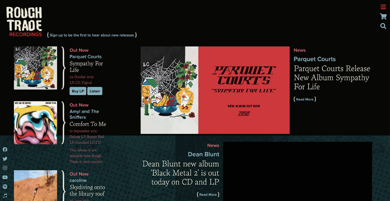
As both brands were currently using a very white colour scheme, I decided to design the new site to be much darker. This site would be in permenant dark mode! The red hue that had been part of Rough Trade Records' branding up to now felt very harsh against a black background so I used it sparingly (just the 'Records' under the logo and the menu button use it in the new design), and selected a paler red to denote context information. I brought in a complimentary pale blue for links and navigation. The label had been using a crumpled paper with halftone dots texture in some recent advertising and were keen in incorporate it, I added it as a blue-tinged horizontal background plane on listing pages and as a vertical context panel background on informational pages.
Structurally, I wanted to add more internal navigation points. I did this with context panels on artist pages and news posts. These allow the label to highlight featured releases and provide fans with other avenues to explore the site.
I have designed complimentary webstore themes for the label's UK and US webstores, which will be launching soon.