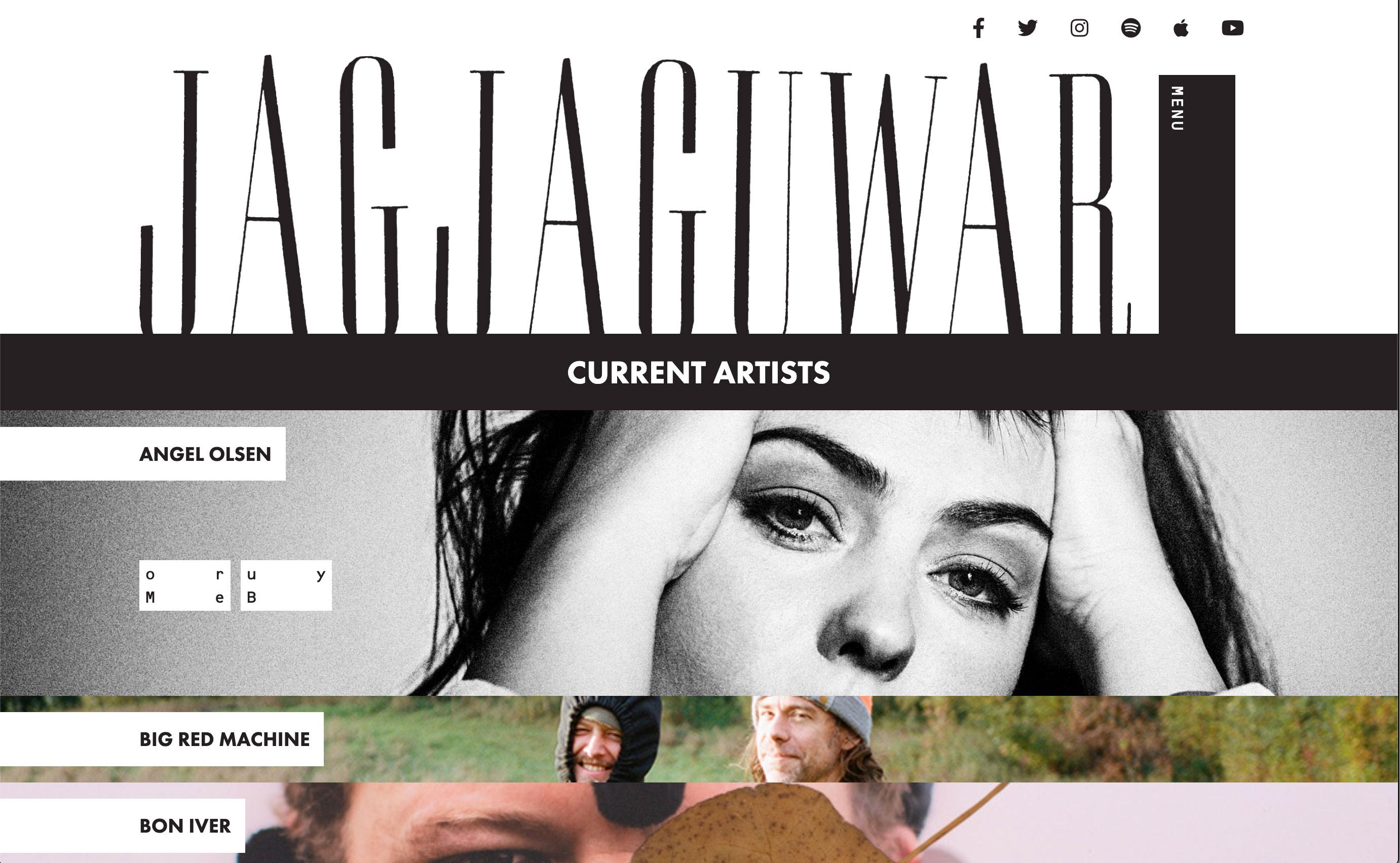
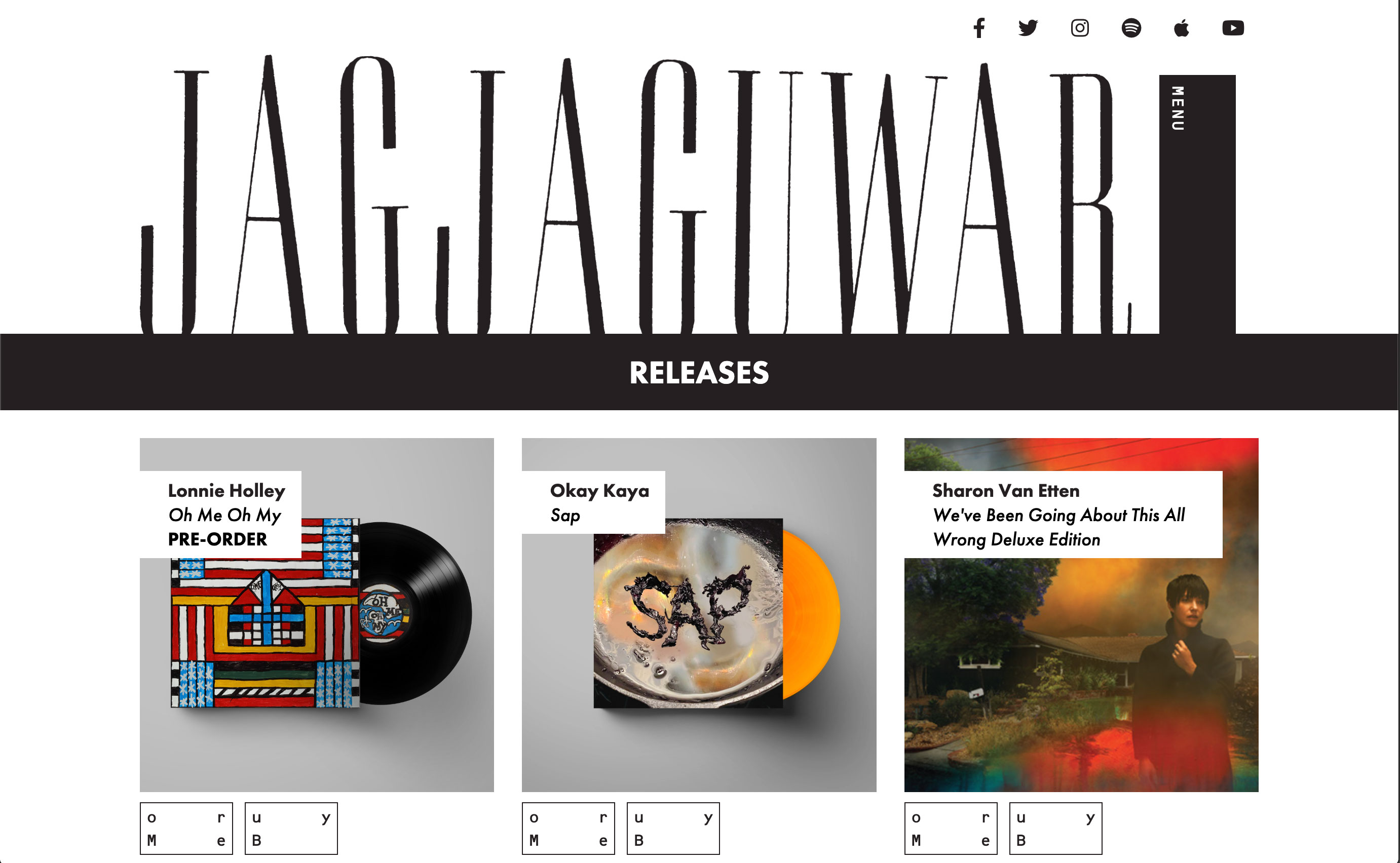
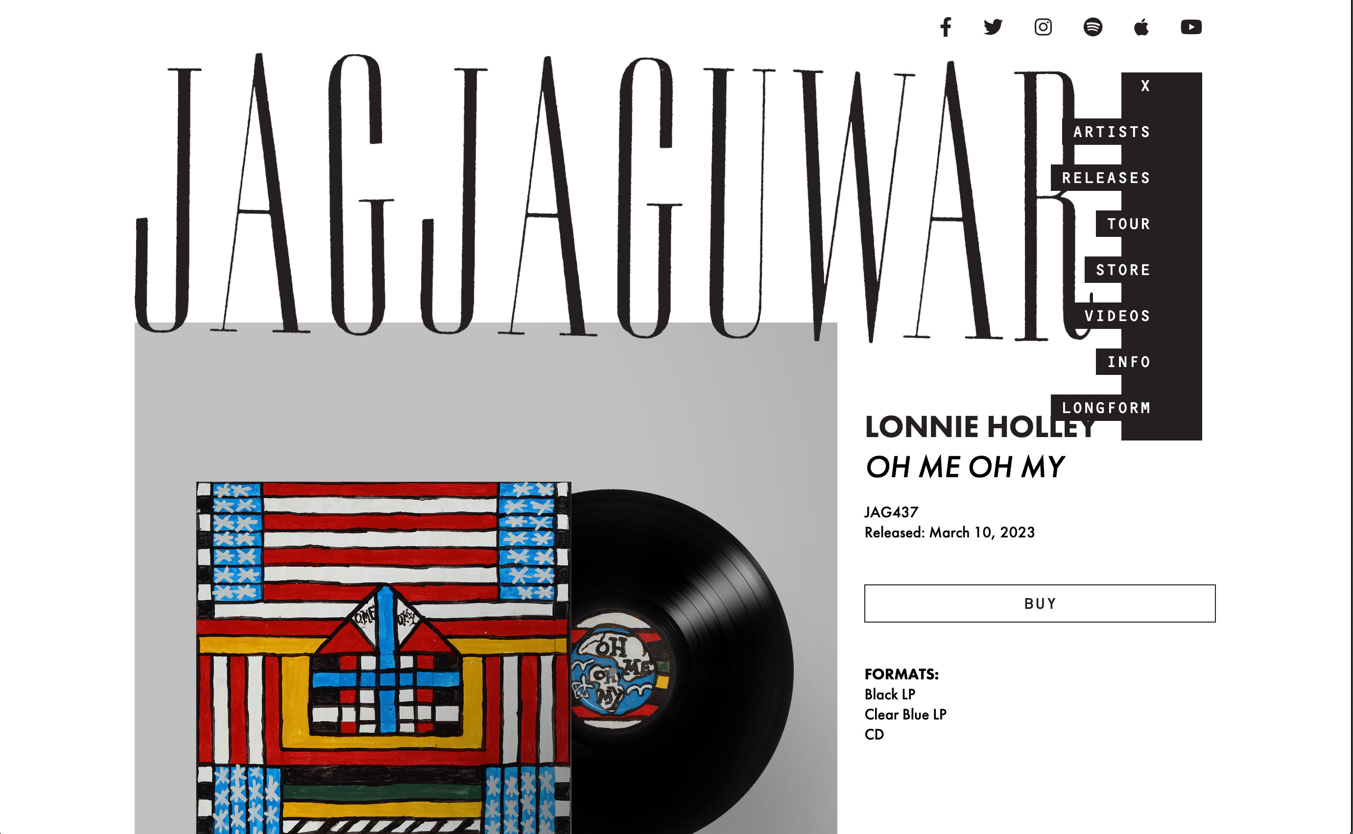
Jagjaguwar approached me in the Fall of 2022 to design and build a brand new label site for them, the old site had become stylistically stale and functionally clunky and buggy due to over-reliance on outdated plugins and they wanted something fresh and clean to help them ring in the new year.
While simplicity was important, we also wanted to nod to the deliberate off-kilter tension in the misalignment of the letters in the label's logo. I explored these ideas via design touches including deliberate overlapping of page elements, slightly skewed angles to certain elements, unexpected rollover animations, and an unusual, cut out style site navigation.
I also added an easter egg for anyone that scrolls all the way to the bottom of the home page!


